[We’ve just put out a quick bump to 0.10.9 to include a few fixes. Notes below apply to 0.10.8 and 0.10.9]
Lots of great changes have been added by our growing team of contributors as highlighted below. If you want to join the team come and say hello at the team discussion on Matrix
Updates should appear on TestFlight and Play Store today.
v0.10.9 Release
iOS:
- App Store - preview release as 0.10.7(32)
- TestFlight (will be visible later today)
Android:
- GitHub
- Play Store
- If you want to stay up to date with the latest releases before it gets on Play Store or F-Droid, checkout Obtainium
Hey everyone! I know it’s been a few days since we’ve released but we’ve got a feature packed release today! Thanks to all our users and the continued feedback, keep it coming!
Change log
- Added MP4 and some redgif support (jjcomer)
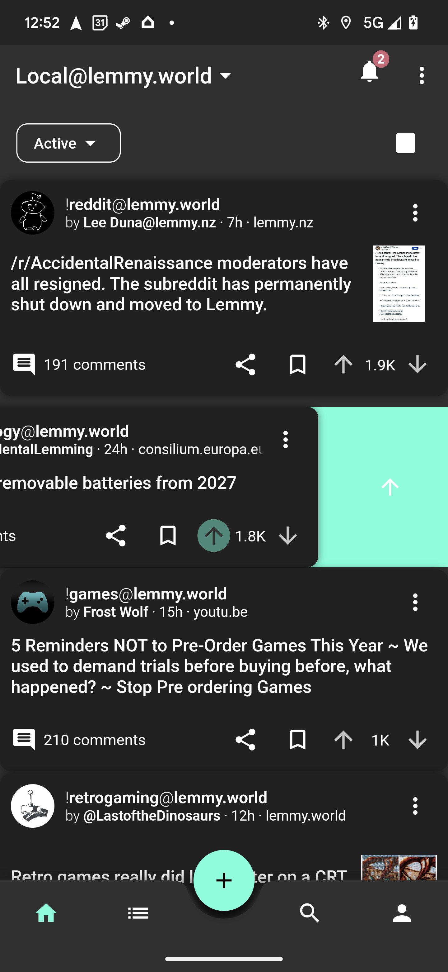
- Added swipe gesture actions! (shocklateboy92)
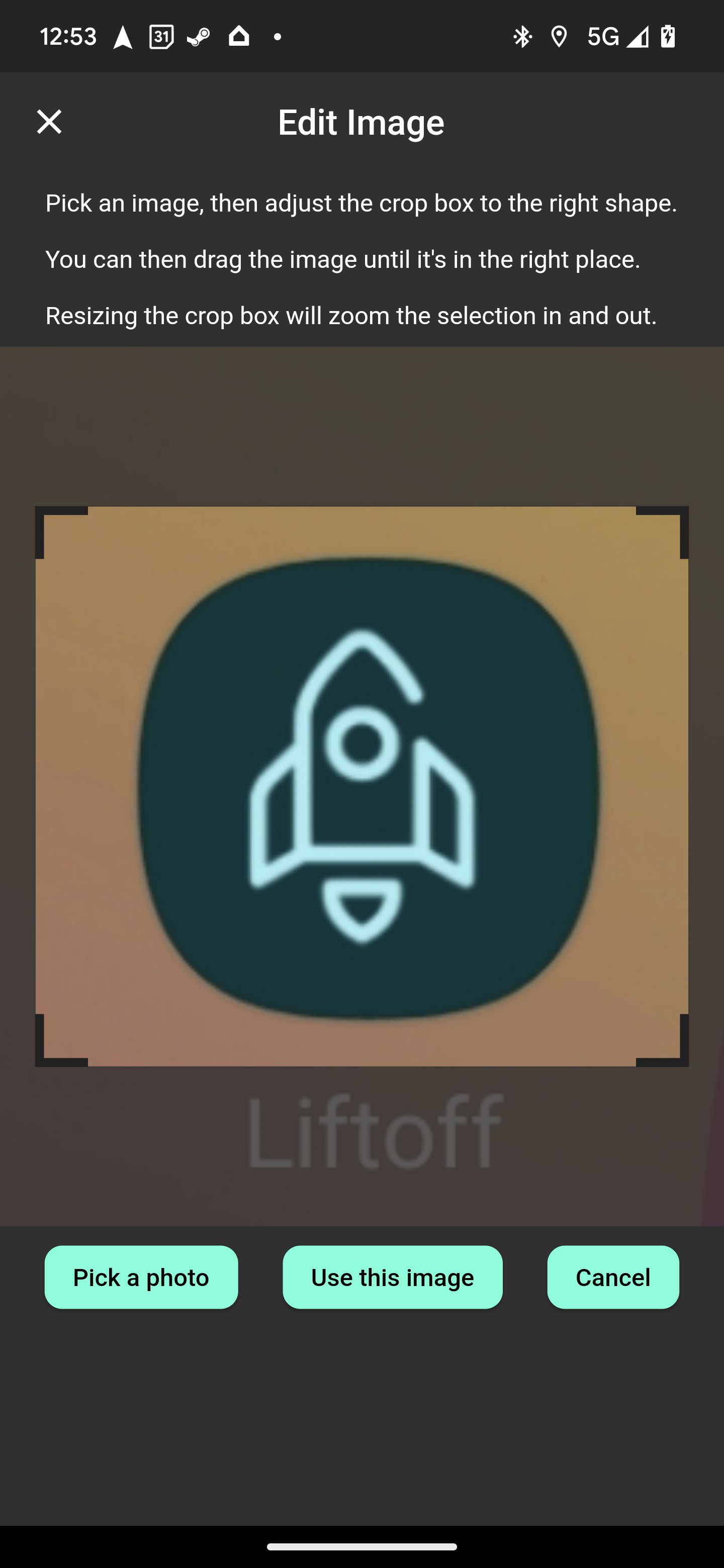
- Added photo cropping before upload! (mykdavies)
- Added code of conduct and tweaks for iOS release (mykdavies)
- Redesign of home tab and themes colors (swmarks & a_minh)
- Fixed alignment of post pills/chips (mykdavies)
- Redesign of compact view to be more compact (zachatrocity)
- Added help text on account page to help guide the user (mykdavies)
- Added RU (asher) and EO (mykdavies) language localisations
- Tons of bug fixes!
Screenshots


Known Issues
- We hear your concerns about dark mode and will address these.
- Swipe actions against posts don’t always update the post’s icons.
What’s coming
- iOS and Android full release! We’ll keep test flight and early access going for beta testers!
Contrast feels a lot nicer, thanks for the update!
I wish there was some spacing in-between posts though. It feels like they blend in together a little.
Edit: turning off card shadow in compact mode helps a lot
Yeah turning off shadow is great. I should have updated the default. Light mode needs the shadows
I’m using it on a Linux laptop. The swipe gestures on a multi-point touchpad is simply the most intuitive and user friendly navigation I’ve experienced natively from any Linux application ever.
This is awesome, you’re getting on so fast!
One thought - I wonder if dark mode is a little too dark, could maybe do with being slightly grey/blue and have post shadows off by default (but on in light mode). Love the green dividers in amold mode!
Best Lemmy app by far!
Love the swipe actions! This might already be planned, but one thing I’ve seen with other Apps is haptic feedback during swipe, as you go from no action to action #1 to action #2.
Keep up the great updates!
Ah it finally rolled out to me, I love the swipe gestures! Only additional requests with swipes is to be able to customize the actions, have haptic feedback, and toggle on/off.
I’d love to be able to short swipe to upvote + long swipe to downvote. I had it set up that way on Apollo for years and it would be such a big QOL thing for me lol. (example)
Some misc things:
- highlighted text shows cut/copy/paste but not replace, look up, translate, etc. (screenshots)
- text replacement is still wonky (screenshots)
- setting for text size throughout the entire app instead of just on posts/comments (example)
- tap very top of screen to scroll to top (edit: it works on the home feed but all pages)
I appreciate all the time + hard work everybody is putting into this :)
I just want to thank you, I always liked Lemmur more than any alternative and missed it. I am happy to see the project brought back to life.
Please add a way to disable swipe actions. I’ve been bouncing between 4 different apps, and I thought Liftoff already had them and I disabled them, but they came back overnight, but I guess you’re saying they’re new. Please add a way to disable them. I really don’t like them. I trigger them all the time by accident, randomly voting on or saving things.
I just discovered Liftoff today, and I like its minimalistic design. However I noticed that some random NSFW images in my timeline won’t load, as you can see in the screenshot. These posts display fine in other apps. Maybe this is something you could look into.
Otherwise, keep up the great work!
Edit: display NSFW setting is on of course.

Does anyone else have an issue with posts not being marked as read?
deleted by creator
deleted by creator
deleted by creator
Great update. Love the swipe actions.
They’re kinda fun! Just been figuring them out to upvote you!
I’m going to join the gang of dark mode is too dark.
I see that it splits the comments in half, so maybe if it is possible to add a grey mode that looks like the old dark mode, both sides could be happy.
I use dark mode as much as possible, but this dark mode is migraine inducing to me due to the white on black colorscheme.We’ll add back the grey mode
will there be a fix for the sorting in our profiles not working? if you click sort by new, it does nothing :/
p.s: thanks for adding the save post button back in 0.10.9 - saving post works great now.


